8 Appendix: Model fits and data for all observers

In this section I show the complete collection of model and diagnostic plots for all observers.

8.1 Model fits in perspective and contour plots

The following figures illustrate the main effects of the motion model described in Section 4 as fitted to each observer’s data. They are formatted identically to Figure 5.3 and Figure 5.4, as described in § 5.3.


pict

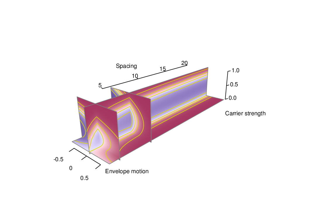
Figure 8.1: Perspective view of fitted model for observer AS. The format of the plot is the same as Figure 5.3.


pict

Figure 8.2: Model fits and summary of data for observer AS. The format of the plot is the same as Figure 5.4.


pict

Figure 8.3: Perspective view of fitted model for observer CJ. The format of the plot is the same as Figure 5.3.


pict

Figure 8.4: Model fits and summary of data for observer CJ. The format of the plot is the same as Figure 5.4.


pict

Figure 8.5: Perspective view of fitted model for observer JB. The format of the plot is the same as Figure 5.3.


pict

Figure 8.6: Model fits and summary of data for observer JB. The format of the plot is the same as Figure 5.4.


pict

Figure 8.7: Perspective view of fitted model for observer JE. The format of the plot is the same as Figure 5.3.


pict

Figure 8.8: Model fits and summary of data for observer JE. The format of the plot is the same as Figure 5.4.


pict

Figure 8.9: Perspective view of fitted model for observer KO. The format of the plot is the same as Figure 5.3.


pict

Figure 8.10: Model fits and summary of data for observer KO. The format of the plot is the same as Figure 5.4.


pict

Figure 8.11: Perspective view of fitted model for observer MC. The format of the plot is the same as Figure 5.3.


pict

Figure 8.12: Model fits and summary of data for observer MC. The format of the plot is the same as Figure 5.4.


pict

Figure 8.13: Perspective view of fitted model for observer ML. The format of the plot is the same as Figure 5.3.


pict

Figure 8.14: Model fits and summary of data for observer ML. The format of the plot is the same as Figure 5.4.


pict

Figure 8.15: Perspective view of fitted model for observer NJ. The format of the plot is the same as Figure 5.3.


pict

Figure 8.16: Model fits and summary of data for observer NJ. The format of the plot is the same as Figure 5.4.


pict

Figure 8.17: Perspective view of fitted model for observer NS. The format of the plot is the same as Figure 5.3.


pict

Figure 8.18: Model fits and summary of data for observer NS. The format of the plot is the same as Figure 5.4.


pict

Figure 8.19: Perspective view of fitted model for observer PBM. The format of the plot is the same as Figure 5.3.


pict

Figure 8.20: Model fits and summary of data for observer PBM. The format of the plot is the same as Figure 5.4.


pict

Figure 8.21: Perspective view of fitted model for observer TL. The format of the plot is the same as Figure 5.3.


pict

Figure 8.22: Model fits and summary of data for observer TL. The format of the plot is the same as Figure 5.4.


8.2 Sensitivity to envelope displacement

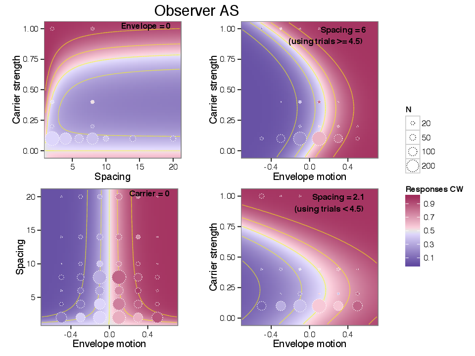
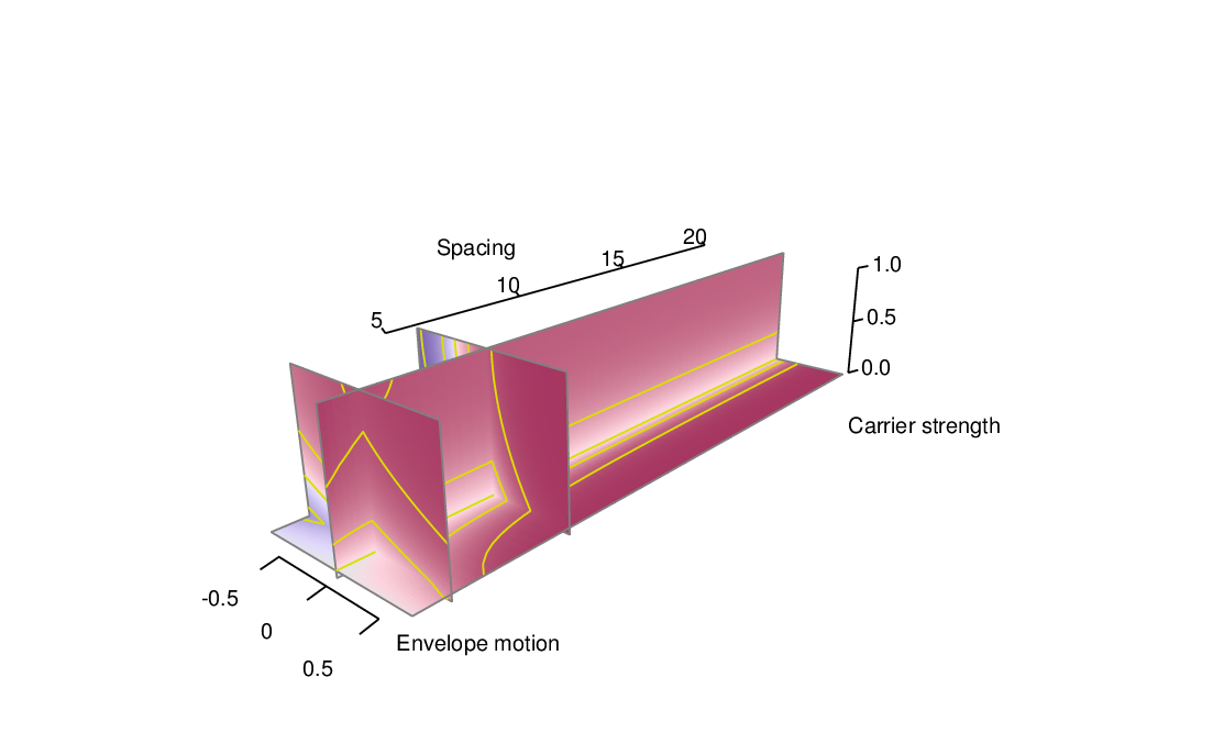
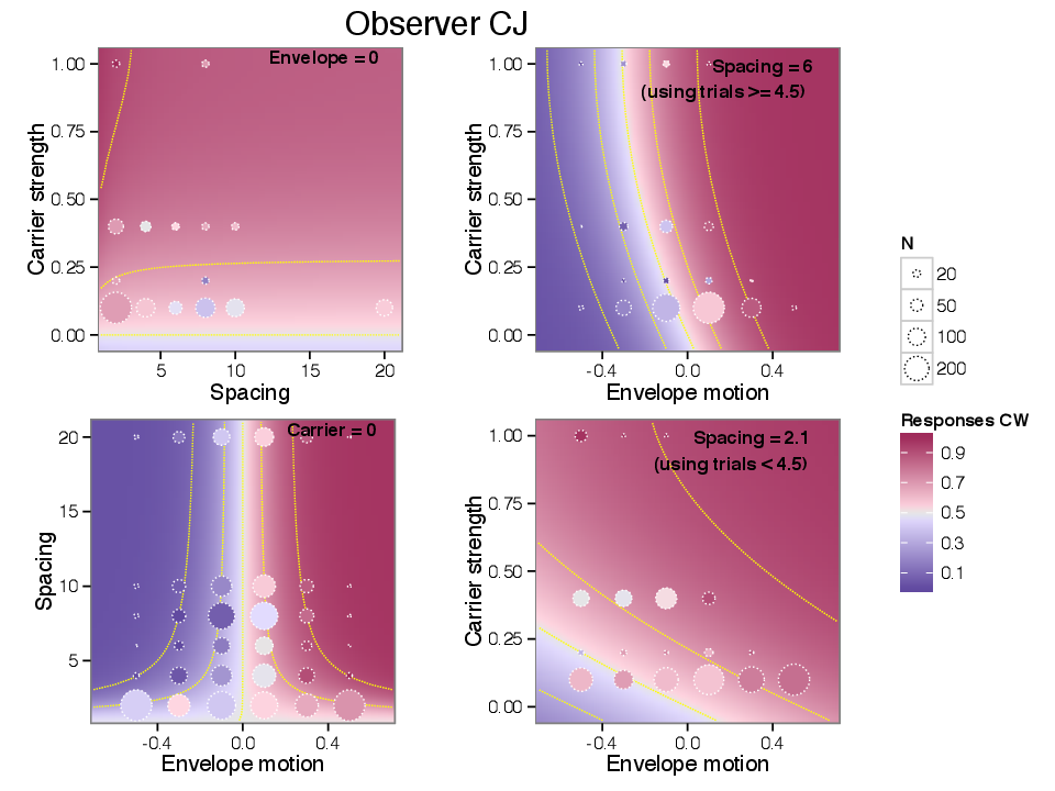
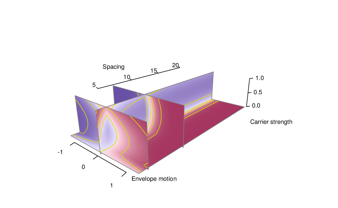
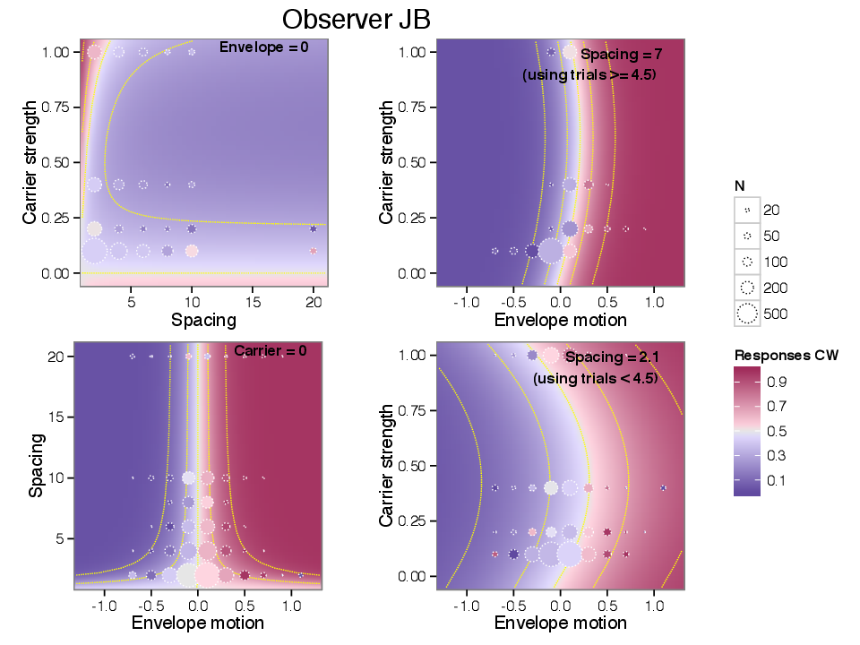
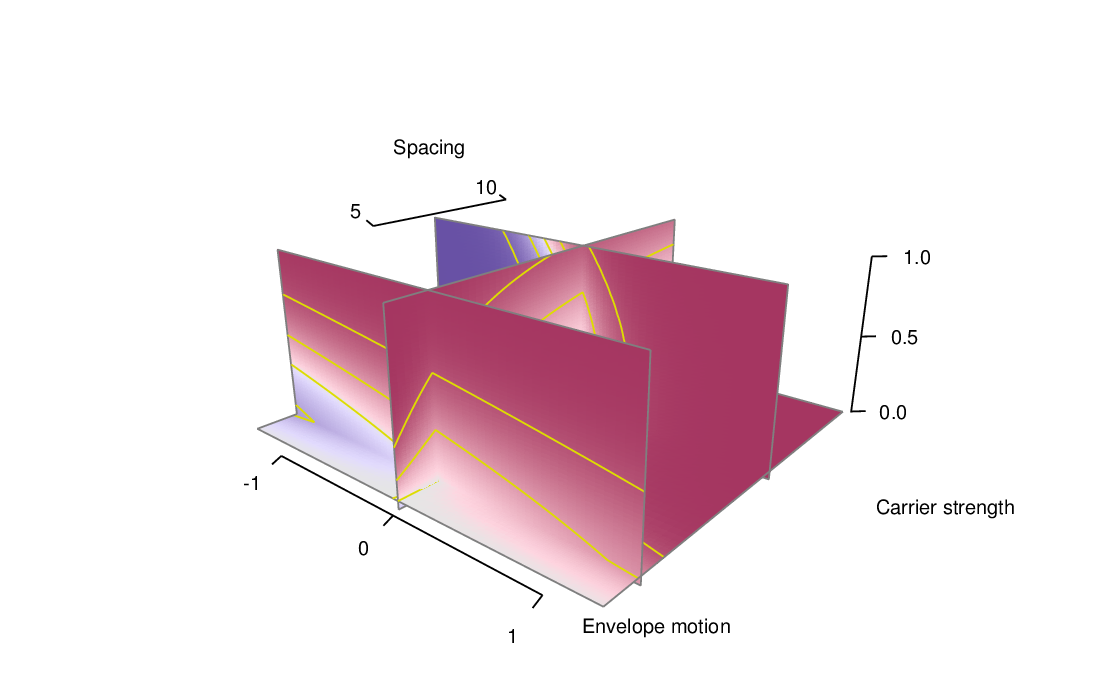
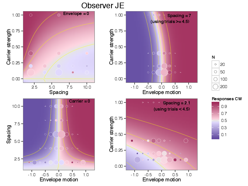
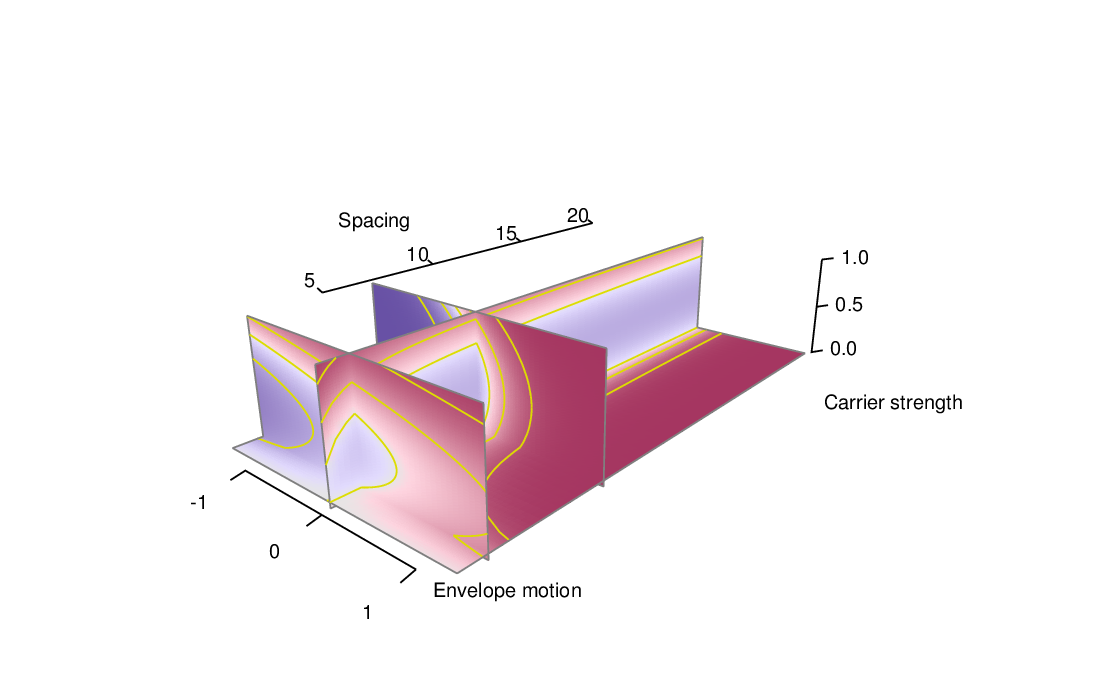
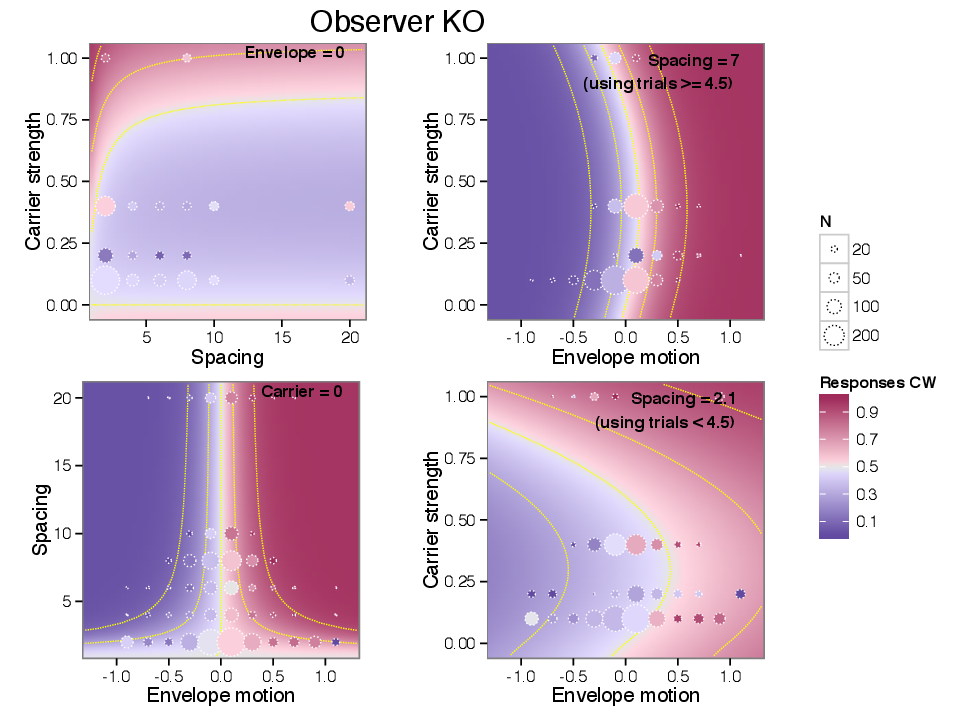
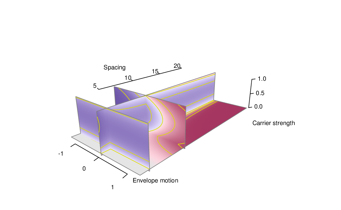
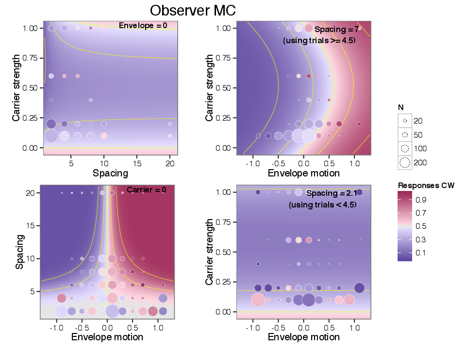
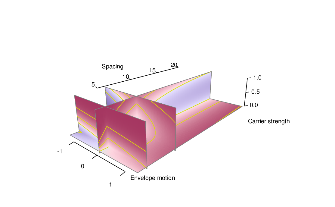
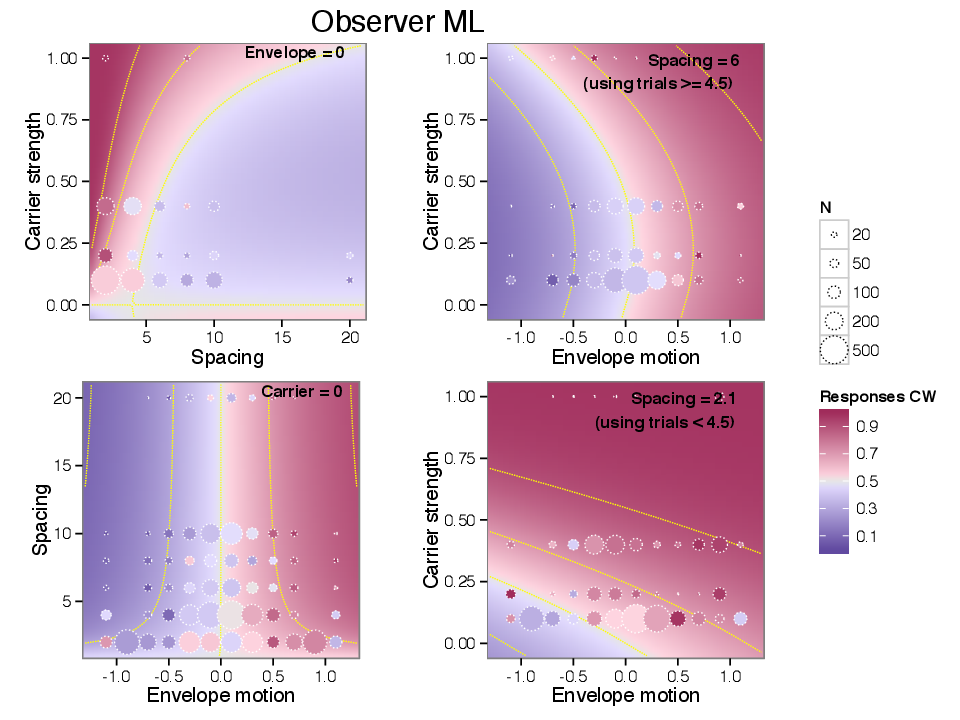
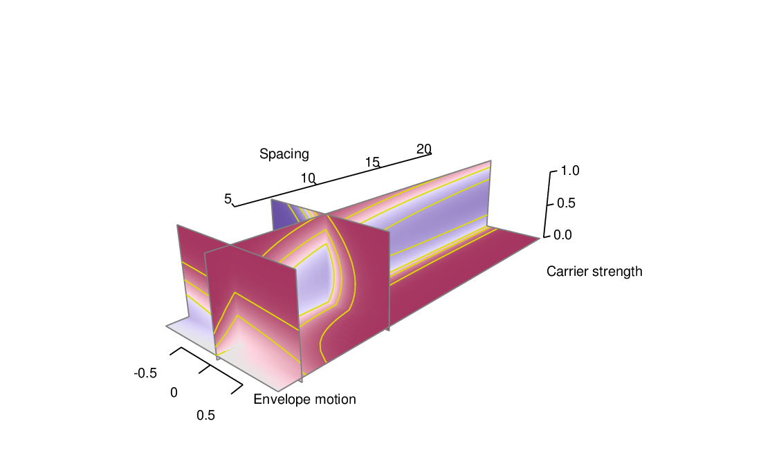
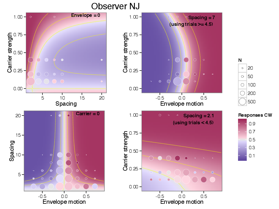
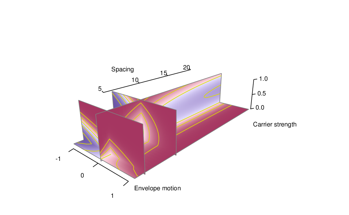
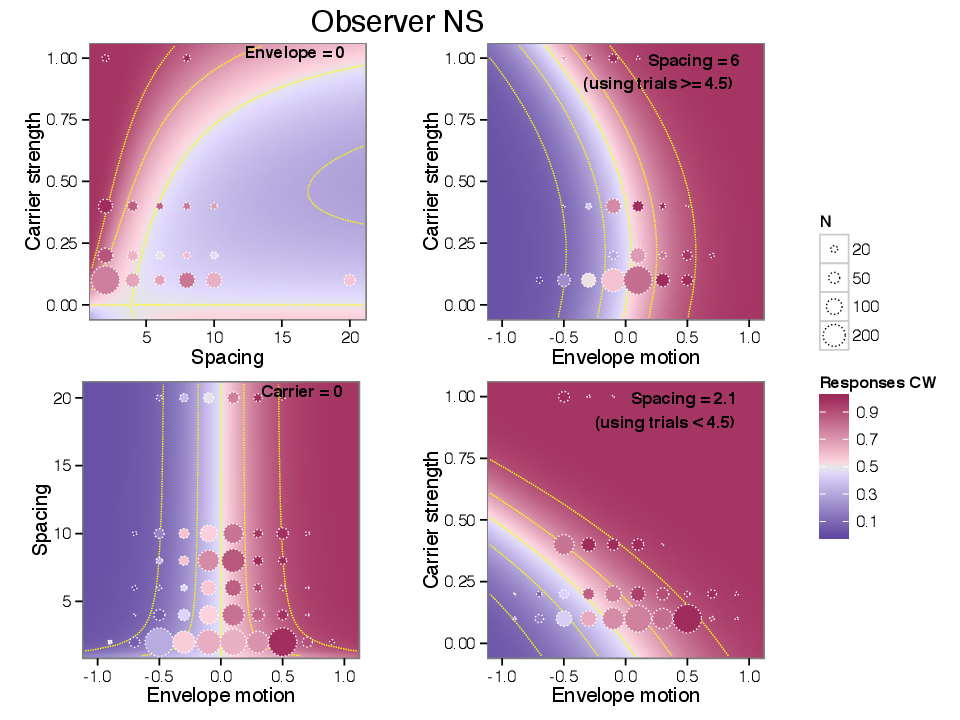
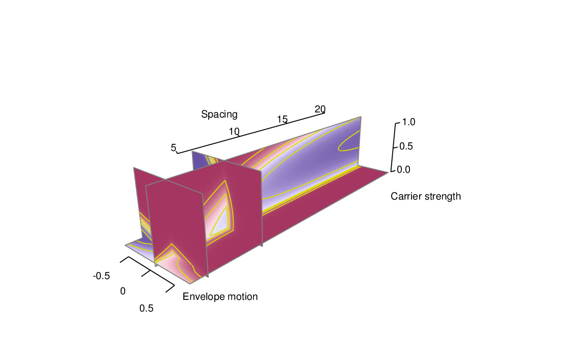
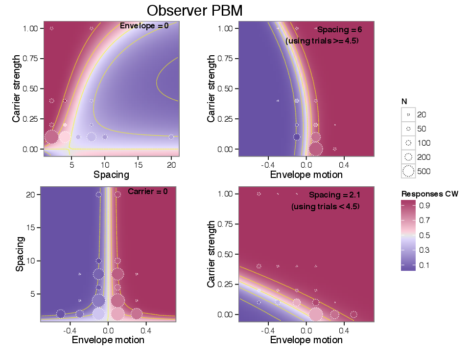
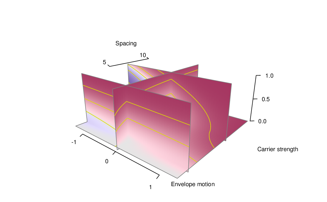
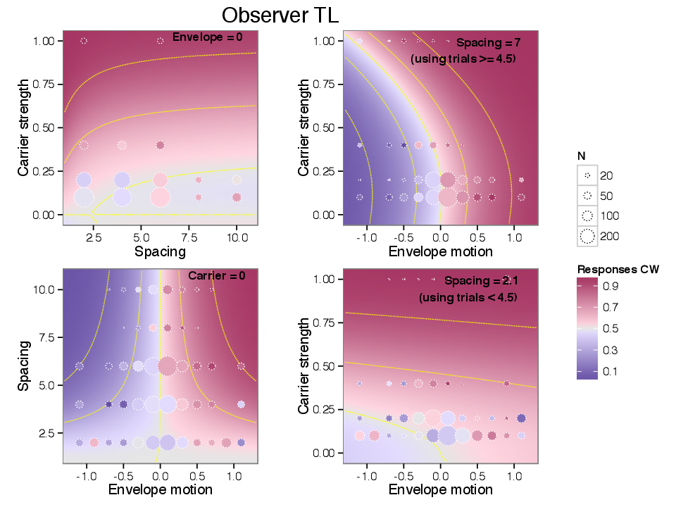
Figure 8.23 depicts the sensitivity measure βΔx(s) as a function of spacing. The construction of the measure and the figure is the same as described in § 5.4.3.


pict

Figure 8.23: Sensitivity to envelope motion as a function of element spacing. This is a complete version of Figure 5.5 showing all observers, and is otherwise formatted identically.


8.3 Sensitivity to carrier motion

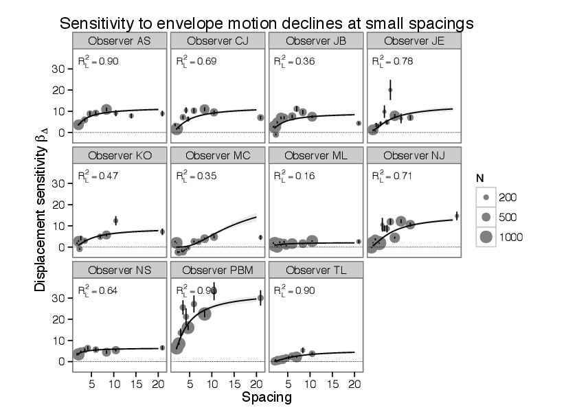
Figure 8.24 measures the spacing-dependent summation of carrier motion, denoted in the model as MS for all observers who participated in the experiment. The construction is described in § 5.2.2.


pict

Figure 8.24: Sensitivity to carrier motion as a function of spacing. This is a complete version of Figure 5.6 showing all observers; see § 5.2.2 for details on construction.


8.4 Carrier repulsion

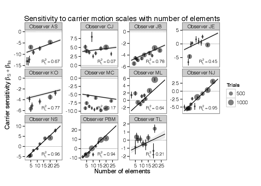
Figure 8.25 depicts the repulsion to carrier motion MI for all observers who participated in the experiment. The construction is described in § 5.4.6.


pict

Figure 8.25: The strength of the repulsion effect as a function of carrier strength. This is a version of Figure 5.7 showing all observers; see § 5.4.6 for details on construction.


8.5 Number and spacing

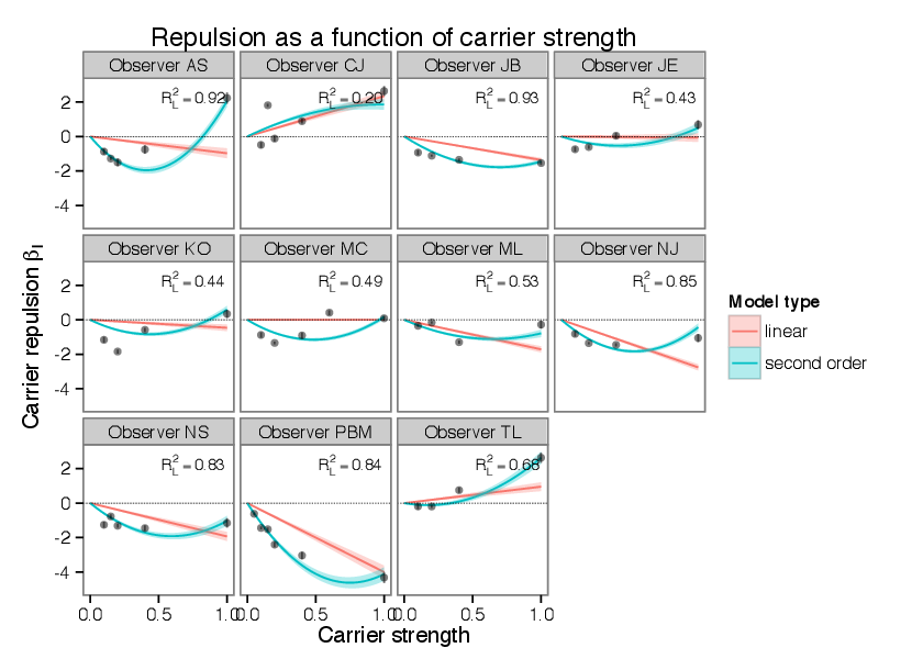
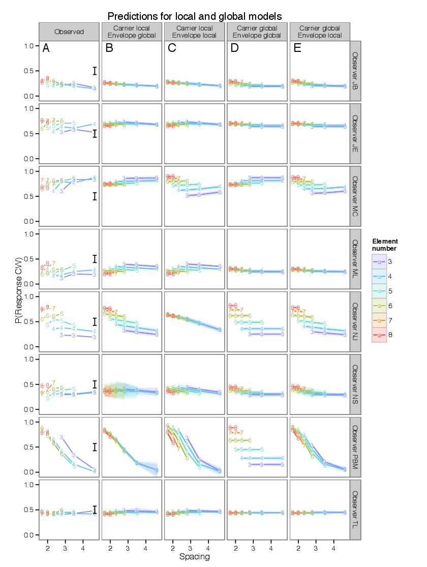
Figure 8.26 compares four model predictions for data from Experiment 2, as described in § 6.2.2.


pict

Figure 8.26: Predictions for four models compared to data from Section 6, after Figure 6.4. Vertical axis measures the proportion of responding “clockwise” to a stimulus, while the horizontal axis measures inter-element spacing; colors and labels show the number of moving elements shown. See § 6.1 for details.